Monday, 25 November 2013

History of Music Videos

Music videos have evolved massively as a result of the growth of both television and the music industry in the past 50 years or so. The very first form of the music video began in the 1920's with the veta phone  and spooney melodies. with short extracts of films being extracted and accompanied by a particular song or jazz piece. The establishment of the commercial radio in the 1930's  was the first time in which music could reach a large audience, and during the war years music by artists such as Vera Lynn was able to manipulate and uplift a broken Britain and keep the spirits up of the people as well as maintaining the Dunkirk spirits. From then on the radio became a key aspect of broadcasting music and has continued right up to the present day with radio music representing a massive 40% of the way in which a global audience listens to music daily with radios still being used in the car, home and on line.


The definition of a music video is ' a short film which accompanies a song, they are produced for either promotional or artistic purposes'. The 1960's saw the first modern form of music video with the creation of one of the most recognisable pop groups of all time 'the Beatles' Their music video 'hard days night' is probably the earliest form of what we would now call a modern music video. It was produced in 1964 and directed by Richard Lester and depicts the boys from the Beatles as ordinary and relatable. This convention is still highly used today as it allows the audience to connect better with the artist and see that they are just having fun and appeal to a wide audience. The video from a short film had a big influence on the music industry and paved the way for similar bands such as 'The monkees' to begin producing their own music videos largely because of the amount of audience appeal and commerical benefits the Beatles received, as the song and video was able to be branded together therefore making more profit. 


Queen at the start of Bohemian Rhapsody
British TV programme 'Top of the pops' began to influence the world of music further in the 1970s where a top 40 chart used to showcase the most popular music on a weekly basis. Artists aimed to be shown on this programme as it would massively increase sales of a song to the viewer, and the audience would hope to see the audience the following week if the song was still in the charts. This led for popular rock bands such as 'queen' to produce iconic music videos such as 'Bohemian Rhapsody' which again proved to be a vital tool for making the song a success and influence a greater number of people. Music videos shown on television continued to grow in popularity throughout the 1980's as a way in which an audience, TV channels specifically designed to showcase music such as MTV in particular was aimed towards a younger audience who could connect with the songs and for the artist ultimately give the musician better sales.

By far the most iconic and expensive music videos was for Michael Jackson's song 'thriller', this 13 minute long film was released in 1983 and cost a massive 7 million dollars to produce. The video itself was eagerly anticipated for weeks and shown all over the world late at night in order not to scare and frighten minors because of its explicit and for the time scary scenes. This only anticipated the release of the song 
further and made the production of thriller more exciting and generated more money for the record label. The groundbreaking video has won Grammies, and the technologies at the time were used to realistically recreate gore and shock the audience which ultimately were taken in by the music video and then went and bought the song making top of the charts around the world for a long time. Michael Jackson then went on to create the most expensive music video to date 'scream' which was created in 1995 and cost an amazing $12 million dollars to create. The lack of special effects at the time meant that all the effects had to be made by hand, with the model of the space craft being crafted without the aid of advanced computer technology. For the time the video was incredible with the scenes looking very futuristic and completely extraordinary.


Music videos now have became one of the major and most recognisable ways in which an artist can relate and sell themselves and there music to the public. The creation of digital media such as smart phones, youtube, and websites such as 'vevo' have only made the medium of music videos excel further. The changes in music videos and the more accessible they have become in the present day is manipulated by the music industry as they know they can target a much bigger audience and make a lot more gross profit by creating further anticipation from the release of music videos, and then stream them on line. Advertising is also used in music videos now with certain products paying millions to be featured in a world famous artists music video. Social media sites such as twitter enable the release of a music video to be heightened further with fans of an artist tweeting and blogging about the video to get it trending on line and allowing it to reach a larger audience this is encouraged by the music industry who can promote the video further and the record label can make more money from it. Music videos now are completely diverse and can use extreme amounts of special effects thanks to the advances in technologies. This is the main difference regarding the changing music videos of the last 50 years. The more technology available with special effects and CGI being used frequently, means that unlike in the 80's and 90's budgets for music videos has actually gone down allot, with iconic videos nowadays being created cheaper because of the technology and green screen technology that is readily available for a much cheaper price.

To conclude ultimately technology is changing. and special effects and changes in the music video will only evolves and trends we are seeing today in the music industry. The production of music videos for world artists is timely and expensive, this combined with the information on social media has made the viewing of music videos much quicker as world wide audiences can count down the release and view the video of they're favourite artist online. Music channels such as MTV still showcase a variety of music which again adds to the success of the song, and appeal to the target audiences. Music videos have changed massively over the years with popular genres evolving over time and different trends in style and music videos changing with it. The changing music videos now appeal to a variety of conventions from Goodwin's theory such as the portrayal and sexualisation of females, according to genre and this only adds to the success of the artist and the music industry. Collaborations within music videos also makes a video more popular when two world artist's come together this combines the target audience and fans of the artist who are intrigued too see two iconic musicians perform together. In conclusion music videos will change further yet one important factor remains. Music videos have always and will always have the primary purpose of advertising both the artist, song and record label which will give more profit to the record label and its subsidiary companies with the most talked about videos generating the most money.


Beyonce and Lady Gaga perform
in the iconic video 'Telephone'


Wednesday, 20 November 2013

Magazine Advert Reflection

For our advert design we each designed a poster that could represent the artist and therefore make her more appealing to the target audience. We wanted to convey the conventions of an indie artist and show her to be both rebellious and look iconic which we know would appeal to our target audience of young people aged between 13 - 25. We each created our own individual idea about how we can appeal to our target audience and sell the image of a grungy and indie artist to 13 to 22 year olds. This involved focuses on urban areas and taking inspiration from graffiti and grimy surroundings.

In order to appeal to a largely yet individual audience, I researched adverts from our chosen indie artist Nina Nesbitt as well as looking at female artists such as Florence and the machine who over the years although indie has appealed more and more to a mainstream audience. This assisted me in planning my magazine advert as I was able to take on key concepts of an indie artist which were to focus on interesting iconography which appears conventional to an indie artist. This iconography in a dramatic location appears on tour posters as well which again is a key selling point as many people interested in indie artists are also interested in seeing the artist live therefore gig posters have to follow conventions in order to make them as an artist more successful.

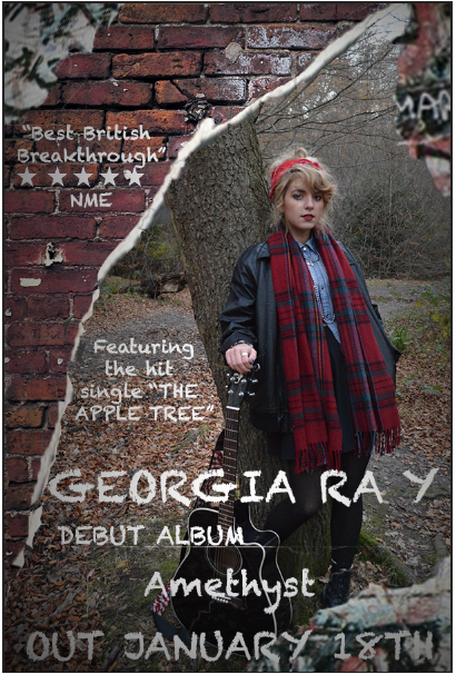
My idea was to portray the artist in provocative and unique individual clothing and have her stand with her guitar next to a brick wall with the album name appearing as posters next to her. This fits in with Goodwin's theory as the image of a female artist helps sell the artist to the public. Upon reflection with my groups ideas the image Georgia drew of the artist actually went very well with my concept of a grimy brick wall which sells the concept of a more alternative and grunge influenced artist yet still keeps the artist appearing unique and fashionable. This was defiantly a contender for my final subsidiary design.

My paper designed helped with putting my design onto photoshop as I was then able to have a clear idea of the conventions of both adverts and tour posters look like when portraying an indie artist and making them more of a success. The first magazine advert I created came from our own idea to use images from our filming to build a relationship between our video and our subsidiary product, however upon reflection there was certain elements I think we could improve on for our final one.

Draft for our Final Advert.
The design encompasses the indie genre in a variety of ways. The graffiti on the brick wall portrays the artist as edgy and unique, the 3D writing gives the artists name a greater impact on the audience which overall makes the advert more of a success.

My problems with this advert is although I was able to bring my idea of the brick wall into my digital version from the paper magazine advert, I feel although the images fit in with Goodwin's theory of building a relationship between the image of the artist and the subsidiary product I don't think the images are dynamic nor look professional enough for the final advert.

The advert appeals to the indie and pop genre as the artist appears a fashion icon which again is a key feature of dyers star theory. The clothes she wears look cool and she appears both rebellious yet enjoying being young which will appeal to our target audience.

I think the typography looks very dynamic and will also be a key feature for my final advert, although somewhat happy with my design I think we can include more ideas from our original paper designs and use the ideas of poster and add more aspects of grime and alternative music, such as displaying more text in the form of pasted posters which will play a bigger role in our final subsidiary, as well as featuring our artist in a larger yet just as iconic and dynamic light which will further appeal to the audience and will be conventional to both the pop and indie music genre.

JENNA'S ADVERT

 Jenna's advert shows a proficient use of adobe photoshop cs6 skills that have been used in order to create a advert conventional to the indie music genre. The layering tool has been used alongside the selection tool to place Georgia in front of a graffiti brick wall. This makes the advert appeal to the indie music genre as its purpose is to inspire, therefore by placing Georgia in this setting she is being advertised as a rebellious and iconic young artist making her appeal to our target audience.

The typography is used at the top of the bottom of the advert. This is effective as it gives the audience vital information about our artists album therefore making our artist more successful. The typography could be improved by using a more dynamic font which is more conventional to the indie style. The fact Jenna has decided to use the same font of similar size to advertise both the artist and information takes away the impact of the artist's name. This is not ideal as the purpose of the advert is to catch the readers attention whereas by using this font the name of our artist doesn't stand out enough.  The use of image showcases Georgia's unique style which is successful as the denim and tartan clothing is typical of the indie style and gives her star quality as a raw talent and an iconic artist.

Overall Jenna's advert was successful as it included key conventions of the indie music genre, however the editing style of the image of Georgia needs to be improved and shot in a higher definition camera to make it appear more professional. The typography is also a problem as it looses the advertising element needed to make our advert a successful as Georgians name appears lost in the mix of the other information included. More indie conventions could have also been including such as showcasing Georgia with a guitar which would portray her as a raw talent and appeal to the audience by following the conventions of indie.

GEORGIA'S ADVERT

Georgia's advert in itself was conventional to the indie genre. Key codes and conventions had been followed as the use of brick wall in a naturalistic setting makes the image more dynamic. This was used with the layering tool, and just makes the image look more convention and allows the graffiti style typography stand out more.

The image used was of a much higher quality, and by showcasing the artist with a guitar the conventions of live music that is popular within the indie music genre were followed. This also adds to the purpose of indie music which is to inspire, and display the artist as a young raw talent which will influence and appeal to our target audience.

The clothes within the advert are conventional to the indie genre, and also appeal to the audience as the artist looks iconic and interesting. This helps to package the artist as a style icon, and with the moody facial expresses, looks typical of the indie music genre.

The information on the advert appeals to the audience and follows all the necessary elements needed within a magazine advert. However I believe some constructive criticism of this advert is that the font of the artist appears to similar to the information and review of the artist. Although the font has been designed to be contrasting with the background, it appears lost therefore isn't advertising the artist and impacted the audience effectively enough.

RHIANNA'S ADVERT

The advert created by Rhianna follows minimal conventions of the indie music genre. The skills used to create this advert appear messy and unprofessional with next to no information adversing the artist. The dynamic clothing used portays the artist as a style icon and also following conventions of the indie music genre. This appeals to a wide audience, and also matches with the colour used for the typography in order to appeal to the audience.

The typography needs some kind of border in order to make the font stand out more. The background is conventional to the grime and edgy element seen within many music videos.

However the advert needs a lot of changes before it could be made into the final piece.

As a group we all designed a magazine advert on paper, this came before any work was done on Photoshop. For the final magazine advert we decided to go with a combination of my work and Georgia. We felt these would include the most amount of elements from the indie genre which was needed in order to achieve the most marks. the positioning of Georgia's piece was more uniformed then mine, yet my idea of the brick wall was seen to be interesting and typical of the indie genre. The paper designs allowed us to look in depth at the image of our artist being created, and we chose myself and Georgia's images as they included the use of the guitar as iconography which is a strong convention of an indie artist and would make her more of a success if the article was seen in a magazine by our target audience. We took elements from all Ideas and I was given the task to design our final advert in order to appeal to the maximum amount of conventions. I was chosen as i had a higher level of skill on photoshop and had a wide range of of ideas that appealed to the indie music genre.

Combination of myself and Georgia's ideas.


FINAL MAGAZINE ADVERT  


I took my design and decided that I wanted to completely change the images yet still keep some basic concepts taken from the first draft. Conventions of the brick wall and the industrial location worked well and contrasted with our image of an attractive young female, therefore I wanted to show this even more so in the final magazine advert which my group decided to go with.
The advert I am extremely happy with, after investing a great amount of time editing and collecting various images I managed to put together something which I feel looks pretty professional and authentic of any small time indie artist. I also was happy with the chosen typography which appears big and bold, bright and also mysterious which is a typical convention of the indie genre. Adding in Georgia guitar also makes the image more of a success as the advert is able to appeal to the indie genre and the target audiences love for live music. Music reviews i feel also adds to the feel of the indie genre, which chosen indie magazines used to say positive comments about our artist which again will gain interest from our audience and also  make the artist more successful.

My previous experience with Photoshop meant I knew a substantial amount of techniques regarding layers and professional looking blending. I wanted to convey further to the indie music genre by making a piece that looks artistic, I achieved this by making the advert look bright and artistic which will give the piece more of an impact if it was displayed in a magazine or on a wall of the London Underground. I think the colours of the advert further appeal to the conventions of the indie music genre, dark colours appear in the corners, which makes the advert mysterious yet the pops of bright colours in the background also give the advert a fun feel and make the artist appeal to a more mainstream audience. I used images of newspaper and logos of indie vintage bands to also give the audience something more visually pleasing, and they may take from these images certain ideas about how Georgia may sound and become even more interested in her record and wish to check our other songs on her album 'Gypsy Nights'.

The large typography of Georgia Ray also makes the advert stand out more, with the ombre colours being very in fashion at the minute the writing appeals to a mainstream audience and is on first glance not necessarily typical of the indie genre. This will draw in other audiences and make her more of a success, as this typography becomes a signature piece that appears on her Digi pak. This was done because it allows the audience to build a better relationship between both artist and ancillary products.

Overall I am extremely pleased with everyone's efforts for our magazine advert, the final one was chosen as it conveyed most to the genre of indie and would give the maximum impact on our target audience. I think the fact we chose to link in signature fonts will also make our digi pak and Magazine advert relate more, and the indie conventions we followed will also get us more attention from a wide spectrum of the public.


Tuesday, 12 November 2013

Digi Pak Analyis

The purpose of a digi-pak is used for CDS and usually consists of a gatefold, the term usually describes all soft cd packaging. The digi-pak allows the artist to be represented in a certain way to appeal to the target audience. Each side of the digi-pak is personal to the artist and can contain a variety of things such as lyrics to the songs, pictures and also personal stories. Most digi-paks have a variety of both pictures and lyrics which are able to sell the artist to the audience and allow the audience to get better connected with the songs and the image of the artist. A digi-pak differs from a CD album as is usually contains more slides as it allows the audience to get to know the artist more. this is used by the artist not only because it allows the audience to grasp a better concept of their image, but also because the record company can charge more money for the digi-pak their for making the record label more money.

This digi pak comes from florence and the machine a well known modern indie artist who has frequenty been in the mainstream charts over the past few years and has established her self as a mainstream indie pop artist with a global fan base. This digi pak features dark and artistic pictures, a typical convention of a indie digi pak. The vintage style typography promotes the image of the artist as being indivual and different from the normal conventions of mainstream music. The choice of language with the album being called 'lungs' also sets apart the artist from being conventional to pop and makes her more of an idividual. This follows dyers theory of a star as the fact she is trying to be different shows that she is an extraordinary artist rather than an ordinary one. The design of the CD again appears very artistic and abstract which is conventional of an indie artist therefore promoting the artist as being different and indie.3 The photograph of hands ties in with the theme of beauty and body parts well, meaning the digi pak follows the rule of continuety, a convention seen in all digi paks in the music industry.

The digi pak is designed to help promote the music genre as its an extension of the artist and is able to appeal to the likes and interest of the target audience. Depending on music genre the artist in this case 'florence and the machine' is representing herself as an indie artist she is both artistic and dresses in dark colours in order to look unique and different which appeals to the target audience.

Tuesday, 5 November 2013

Magazine Advert Analysis

The purpose of a magazine advert or tour poster that features an artist is to advertise. This is shown through conveying the artist in a certain way in order to appeal to a large audience and raise peoples knowledge of there work as a musician and make people want to go and listen to them. These functions allow the artist to be promoted in order to produce revenue for their record label through adverts boosting record sales and in this particular advert the sale of gig tickets.

This adverts shows the artist promoting her 'apple tree tour' which was taking place following the release of her EP in 2012. The advert comes before the release of her most well known song 'stay out' which reached number 21 in the mainstream charts in february 2013. This is reflective in the tour poster as we can see the typography of the words NINA NESBITT in big bold lettering to highlight to a mainstream audience who she is, as they may not be able to recognise her face. The use of diverse iconography is evident in this poster as she is holding an apple this is typical of the indie music genre and makes the advert appear different and unique, this also ties in with the visual song links which according to media theorist Goodwin are key attributes of a successful musician. 
The typography also reflects her genre further advertising the price of the gig which is very low therefore encouraging people to go. The small venue also is typical for an underground artist and the fact she plays there shows she is yet to be globally successful and is still undiscovered by the mainstream world.

The typography further demonstrates an understanding of the artist and her music as the letter 'N' appears in a large fairy tale font, much like the start of her 'apple tree song' where the lyrics are 'once once upon a time...' these connotations relate from the lyrics to the visual of the poster hence the reason the lyrics of 'the apple tree' play a part in advertising the tour. The motif colour red has conations of being seductive and bold this also ties in with the artists red lipstick, this makes her appear different and unique with a rebellious attitude, this appeals to the target audience of 13 - 25 year olds with both the mainstream and indie audience with many wishing to copy her trends and see her as an icon.
This advert promotes the music genre further as it shows the indie nature of the artist through the diverse iconography and the passive facial expressions which show Nina to be mysterious and iconic, this is conventional of alternative music magazine articles where the artist is portrayed as artistic and the audience who read the magazine can see she cares deeply about her music and are intrigued by her individual style. The fact she is advertising a gig is again conventional of the indie genre as live performance is vital and a conventional way of engaging with indie music.

The tour poster shows nina at the top of the poster taking up around 40% of the advert, the name of the artist appears much larger therefore conveying that the general audience wont recognise her face as she is new on the scene. However the price makes her gig seem attractive and advertises the gig to her audience who the majority of which are students therefore wont be able to afford tickets to big tours of mainstream artists. The purpose of this is to then show new audiences in the field of mainstream music that Nina is a diverse artist and can appeal to a variety of genres therefore attract a bigger audience and making her more successful.


The next textual piece from a music artist I looked at was a article a tour poster that actually featured in the classic British indie music magazine NME The magazine featured a female indie artist similar to the style and works of Nina Nesbitt. Laura marling appears young and care free in this poster, with low key lighting and dark colours being conventional of alternative music and making her appear mysterious. This shows the target audience which consists of indie music lovers that as an artist she is just beginning and is a new face on the music industry, because of her bohemian image on the poster. Laura fills 75% of the page which promotes her as an ordinary artist, as she appears young and talented. She is also playing guitar which means she is serious amount her perfomance and that installs the audience that she is an indie artist as she is using a guitar as iconography. This is a very strong conventional of all indie artists such as the kings of leon, and the arctic monkies who all are pictured with guitars and other instruments in order to promote the idea of live music which an indie audience is interested in.

Laura shows her folk roots by playing her guitar whilst being pictured, this is very conventional of an alternative indie artist and attracts a folk audience as they will see her as a young new face who is talented at both singing and playing her instruments therefore will boost Laura's record sales as people become interested in her as an artist after seeing her picture in the poster as it advertises when she will next be playing. The typography is big and bold. This is placed in a key place which catches the eye of the reader as it appears in contrasting colours and as if it has been written in chalk. The writing is typical of the indie genre as it is artistic and simplistic yet also eye catching. The writing is both feminine and sophisticated which advertises the style of the artist, and also portrays her as a sexy female which is one of the conventions of Goodwin's theory regarding the appeal of an artist to the audience. The design of the poster advertises the artist to the audience by conveying her as fun and interesting with an intense passion for music. This shows she's fun and likes a laugh displaying her as an ordinary artist to her target audience. The article gives the artist a likeability factor meaning she appeals to the target audience of younger 13 to 22 year olds.

The advert promotes the music genre by displaying her with her instruments which makes her seem talented and typical of the indie genre. The audience are drawn in by this, and if they read into the article can see that she is a fun and lively character which means she can appeal to a wide genre of people including the mainstream who may want to research the artist based on her appearance and come and see her on a cheap low cost venue which is advertised on the poster. This could further appeal to students as with little money they could easily and go and see a small time indie artist as tickets too see large mainstream bands and artists at the 02 is expensive.

Friday, 1 November 2013

Planning Lighting and Colours

Lighting and colour within a music video is used to portray both the mood and feel of a music video. The changing colour can have connotations with hidden meanings, perhaps black and white to show a memory and also high key lighting to show a happy part of the video and low key lighting to express dark themes within the video.

Include still images to support your points

The lighting we will include will vary considerable and will not always follow conventions of mood. Whilst in the inner city at night we will use dark colours to show the reckless behavior of the teenagers smoking, and we will also shoot our artist and her boyfriend under blue light which will give of a cool edgy vibe typical of an indie video. During the day time high key lighting will express both happiness and arguments within the council estate. This is because it will show that during the day the turbulent relationship continues. In the bedroom scenes we will use low key lighting to show the intimacy between the couples and the tension  between the two people.

The blue colour connotes a cool and edgy atmosphere which will show the artist in a diverse environment in the inner city. This will be reflective of the indie genre and show the artist to be iconic and make her successful to the audience. The low key lighting with the glow of fairy lights and candles used in the bedroom scene shows passion and we will also edit more colours into the editing style to express the indie and pop vibe to the audience to make the video more interesting for the audience and highlight the diverse locations used in our videos. Low key lighting will further show the different outfits that will be indie and edgey therefore marketing our artist as different and showing her in a desirable and unique light.

The lighting and colour subverts genre, with the indie genre focusing on diverse iconography and heavily looking at the narrative of the video which we will show through high key and expressive colourful lighting aswell as low key moody light effects that will portray the raw emotion in the video, this is typical of the indie genre. The audience will be able to gain a deeper understanding of the song through our use of lighting showing the happy memories expressed throughout the video. This choice of lighting makes each specific scene stand out and make the video easier to understand for our target audience and engage them on different levels.

This relationship will continue to build as the audience will be able to see the diverse locations used including inner city areas and council estates around London. This will help with the understand of the narrative and show the artist in a realistic setting and make her and boyfriends relationship exciting and realistic. High key natural light will show this reality, with exciting and reckless behavior at night evoking emotion in the artist and fulfilling there request for a reckless and diverse figure.

Planning Artists Image


The artists image to the public is a vital aspect of any music video. Countless artists in the music industry frequently change there image as they grow as an artist. This is to convey them as a trendsetter and to show them appealing to the changing trends of the fashion world. By having a strong image the artist can also attract new and diverse audiences which ultimately makes them more successful as they show themselves appealing to a variety of genres.

Our artists image will move away from Nina Nesbitts relaxed indie pop style and we will aim to create a more rebellious iconic figure.The reason for doing this is to really differ from the artist we picked and build on her style which will ultimately appeal to the audience, as they want to see a rebellious figure within the video to make it more exciting. Our video will be more successful because of this because we will in cooperate ideas from dyers theory of an ordinary turned extraordinary girl which will seem iconic for both an indie and mainstream audience. Goodwin's theory also supports this choice as rebellious artists are said to excite a younger audience, and edgy clothing will make our artist successful through fashion as she will appear a trend setter.

An example of the Grunge style 
We want our artist to appear hedonistic and strong minded. This will appeal to the young audience of 13-22 year old's as the artist will be effective at influencing the trends of young people as well as being someone young females can look up too and be idolised by them. Like Nina the image we want to create for our artist is a strong independent woman who isn't afraid to play around with boys and have fun. We will convey this through a typical teenage relationship with problems and arguments as well as affection and intimacy shown throughout. Goodwin's theory is in co-operated in these choices as the fact our artist is being pursued by men makes her sexually attractive and therefor our artist is more successful at marketing the song because she appears sexy and an iconic established figure breaking onto the music scene. We want our artist to dress with her boyfriend in edgy grungy clothing to look sexy and desirable for our target audience. This differs from Nina's style, as we want to give our artist more of an iconic and alternative style whilst showing her playing the guitar which appeals to the indie genre as well as more of a grimy pop audience. Using a variety of unusual trends makes our artist individual meaning she's bringing something new to the music industry making her more of a success.


We were inspired for a variety of images of indie artists and also rebellious female icons.
We found love by Rihanna inspired us to use similar clothing as Rihanna as she is a successful example of an edgy artist who isn't afraid to try new things and appear iconic. We did however find some of her attire slightly risque for an indie artist, therefore looked to Nina Nesbitt for further inspiration. This was so we could have maximum appeal to our target audience of 12-23 year olds. We wanted to expand on Georgia's actual style as well to make our artist appeal more realistic. By taking into account Georgia's style we were able to make the image of artist more diverse and also appeal real and not posed to the audience. This helped our audience connect more to our artist, and also see the diverse indie clothing appeal stylish and iconic.

An example of the clothes we've used is as follows:

The outfit chosen for the performance was a fix of leather and denim, with pop influenced crop top and neckless. The reason for this is we believed the outfit worked well and also the denim shorts and bandanna worked very well for an indie artist. The fact the outfit wasn't too much also made our artist more relatable and not only did it sell the indie style with conventional indie clothing such as DR martens being worn by Georgia, the outfit also appears iconic and gave our artist a wow factor. The fact the target audience can relate to her more also makes her more of a believable artist and they would wish to copy her style making her an icon which ultimately makes our artist a success.

The influence of We Found Love and the way Rihanna portrays a turbulent relationship has influenced our decision to show a relationship in this way. We will use editing techniques in order to show the artist around London much like Nina Nesbitt in her 'stay out' music video. This will ultimately appeal to our target audience by showing our artist and her boyfriend to have exciting lives,
and make the audience wish that they were like the artist shown in our video. In summary the image of our artist is very important and we want the fashion used to be out of the ordinary and different in order to appeal to the audience and both the indie and pop genres. The behaviour of our audience will be young and reckless, which we found out was the main thing our target audience wanted to see in our Vox pop and questionnaire. The image of our artist further conveys to the indie conventions, as the unique style and guitar is conventional of an indie artist yet her image will also appeal to current fashions and mainstream fashion. The reason for this is so that our artist can appeal to a wide genre of people and also will be made more successful by the strong relationship our artist has with her audience.

Wednesday, 23 October 2013

Planning Editing styles

The purpose of editing is to manipulate and put together a variety of footage in order to form a finalised narrative of a music video. Editing is important  as it allows the director to choose different shots and put them together in order to display to the audience the desired feel of the music video.What is the purpose of editing?

Editing is the process in which footage is manipulated in order to create a desired narrative. Edited can be performed on a variety of platforms, one being Final Cut pro. Editing is successfully used when the audience understands the narrative, with editing frequently being used to evoke certain emotions within an audience and change the way in which a piece of film comes across. Editing is able to create continuity and footage can be changed via tools such as re time and merge in order to create a different reaction from the audience. Without editing, productions would be of a lot slower pace and the desired effect of footage may not be fulfilled. Editing also allows the producer to edit tints and filters on to the clips giving a variety of different attachments to the footage which make the film more successful and impacts the audience at a higher level. By using editing the producer is also able to exclude mistakes that may have occurred during the filming process, and overall editng makes a film have a larger impact on an audience which makes the film more successful.


What style will you include and why?

The editing style we will use will correlate with the indie music genre, and we will use editing to fit in footage of both narrative and performance with the timing of the song. This will be evident when we portray the fast paced nature of the relationship during the chorus, as a variety of clips will show the on screen couples affections. These clips will merge into one giving the audience a greater understanding of the reckless teenage behavior that we are trying to successfully portray. Our editing will also include inserting particular tints to show a sepia type of aged footage, this will make our narrative more interesting and conventional to the indie audience as well as showing the audience that certain clips differ from others. This will be particularly useful when we show the artist reminiscing about memories of her and boyfriend together.

We will also include the following:

Merge Cut

The merge cut is created when inserting two pieces of footage side by side, the slight overlap allows the audience to view two (sometimes contrasting clips) in one swift montage. By using this within our own music we will be able to display a fast paced and reckless relationship with many events and random activities show casing the rebellious teenage relationship to the audience. We will also use this technique when showing the pub named 'the apple tree' which builds a higher lyric visual relationship, as the song title and pub name are the same. This will let the audience relate to the meaning behind the song, and the editing during the chorus will subliminally tie in these messages to the audience, making our video more understandable and successful.

Colour filters

Colour filters are dragged onto the clip and change the overall appearance of the footage. This will be used when displaying the memories of the artists boyfriend, this combined with slow editing will enable the audience to see a distinct difference in each clip therefore indicating that the certain part of the video that has been edited in this way is actually in the past. This will make our video have a greater impact on the audience and give them an insight into why the artist is performing the song in an emotional way. The memories shown will have the sepia and black and white filter over laid in order to show negative and reckless memories that will have an poignant effect on the artist. By doing this we are impacting the audience who will feel a greater sense of empathy towards her.


Re time

The re timing of the clips is a simple technique used to manipulate footage in order to speed up or slow down the clip. This will be used though out the video in order to express the fast paced relationship on screen, and also show the slow poignant memories that mean a lot to the artist. By using this we also have a greater control of the pace of the video, and we can build tension more effectively making our video more visually stimulating to the audience.


How is your editing style conventional to your music genre?

Our editing style is conventional to both the indie and pop music genres, as we are displayed a fast paced sequence showcasing the rebellious nature of the artist and her boyfriend. The desired effect by doing this is to make our artist iconic and inspirational something which the indie music genre also aims to achieve. The edits within our video will keep the grainy vintage feel to the clips, again a convention of the indie genre. We will break conventions in order to achieve a more impacting narrative, as we will conform more to a pop based genre by displaying a rebellious teenage couple who get up to random and unexplained activities. This is effective as it will make our video more interesting and diverse to the audience. Our video will also follow the conventions of indie as we showcase our artist as a raw talent by using jump cuts to switch to our performance side of our video which will show our artist as a raw talent, focusing on her guitar iconography. This is conventional to the indie genre and will make our video a greater success as we are appealing to both mainstream and alternative music genres.


How does it build a relationship with your target audience?

 The editing within our music video will create a higher bond between the lyrics and visuals. By doing this we will be able to show case the song in a more exciting light, which will effectively transfix an audience. The sepia tints and merge edits will also make our video more exiting and conventional to the indie genre therefore appealing to our target indie audience. By show casing the relationship as fast paced we will match our editing styles in order to make both elements work alongside each other, The depiction of the couple will also appeal to the audience who will be inspired by their activities and view our artist as iconic and a trendsetter. Overall our video will appeal to our target audience of 13-22 year olds, and will also be in keeping with the indie music genre. By re timing our clips will be able to show case our artist as a raw talent by shooting her with a guitar making her appeal more to the indie music genre, as well as having an exciting and turbulent relationship which via our fast paced editing will appeal more to the pop mainstream genre.